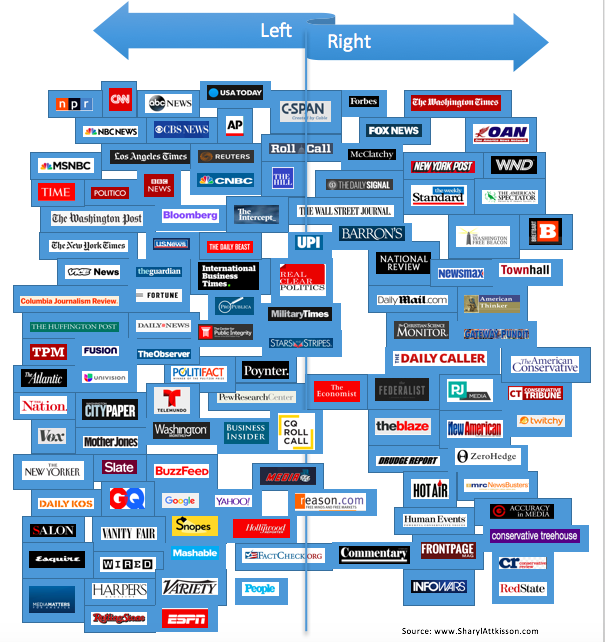
Where’s your favorite information source stand on the political scale?
I’ve updated the following subjective chart based on information compiled from various sources and your feedback. Some sources have shifted left or right, others have been added including: ESPN, McClatchy, the Federalist, Conservative Review, Washington Monthly, Twitchy, Gateway Pundit and Conservative Treehouse.
Please note that outlets on left and right sometimes publish material that’s on the opposite side of the political spectrum, or that has no political leaning at all. The placement is based on perceived overall tone and audience. Position on the chart doesn’t necessarily imply credibility or lack thereof. Sources on far right and far left have, in many instances, produced excellent, factually correct information at times.
I have loosely placed more traditional information sources in the top half of the chart working down toward aggregators, fact-checkers, opinion sites and less news-related sources. (This posed some position challenges since most of traditional information sources are left-leaning.) I did not attempt to place individual programs or broadcasts.
Compiling such a chart is obviously difficult for many reasons, some of them having to do with space. The spacing should be considered relative and not an indicator of absolute position. A number of the information sources technically belong on top of one another.
You have contributed terrific ideas, such as sizing boxes based on audience, and dividing into quadrants. This is a work in progress. Thanks for your input!
Chart below in posts
(Excerpt) Read more at sharylattkisson.com ...